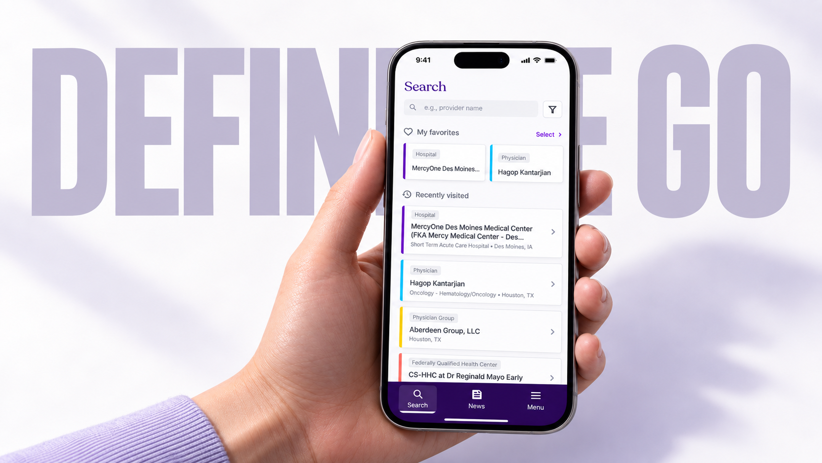
Helping enterprise customers access healthcare data when their work takes them away from a desktop.
PROJECTDefinitiveGo: Healthcare intelligence on the go
DISCIPLINEMobile product design
AUDIENCEEnterprise customers working in the field
PLATFORMMobile app · B2B healthcare intelligence
44%Adoption in three months
86.43%Task completion in three months
2 min 34 secAverage lookup, previously over 10 minutes
01 / OVERVIEW
The context.
Definitive Healthcare provides enterprise customers with data about hospitals, clinics, physicians, and other healthcare organizations. Customers use this information to understand the healthcare market and support their business decisions.
That need continues beyond the desktop. While visiting facilities, preparing for meetings, or traveling between locations, customers may need information without access to the full SaaS dashboard.
I designed DefinitiveGo to bring healthcare intelligence into those moments—giving customers a mobile way to find records, review relevant information, and keep important profiles within reach.
02 / CHALLENGE
Where the friction was.
A desktop dashboard supports detailed exploration, but fieldwork creates a different context. Customers may have limited time, a small screen, and a specific question to answer.
The design challenge was to make a large healthcare dataset useful on mobile while preserving the detail enterprise customers need.
What I learned
Three priorities shaped the experience: help customers find the right facility or professional; make essential profile information easy to scan; and reduce repeated searching for records they use regularly.
03 / APPROACH
Making the complex clearer.
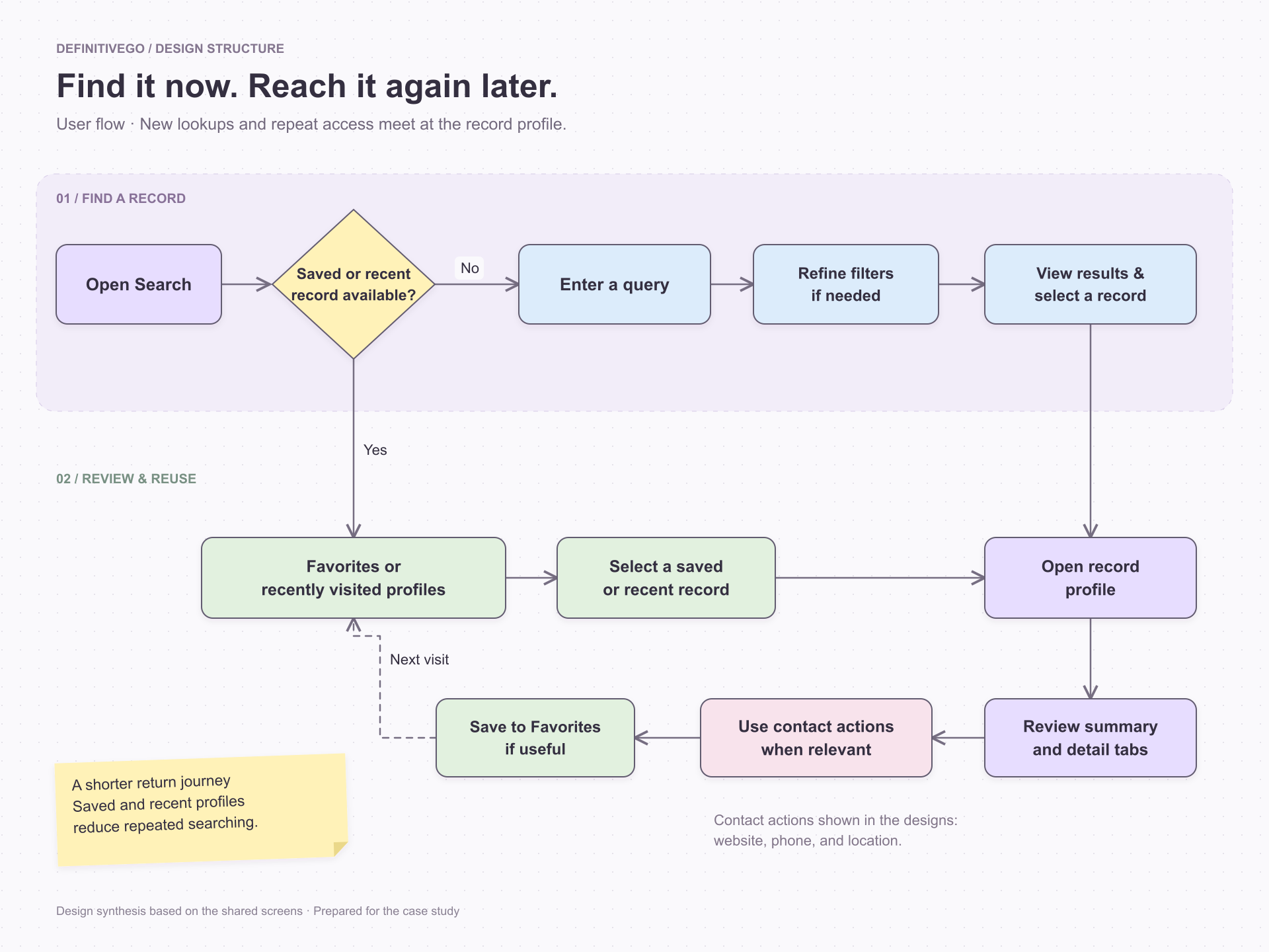
I organized the experience around a focused journey: find a record, understand it, and return to it later.
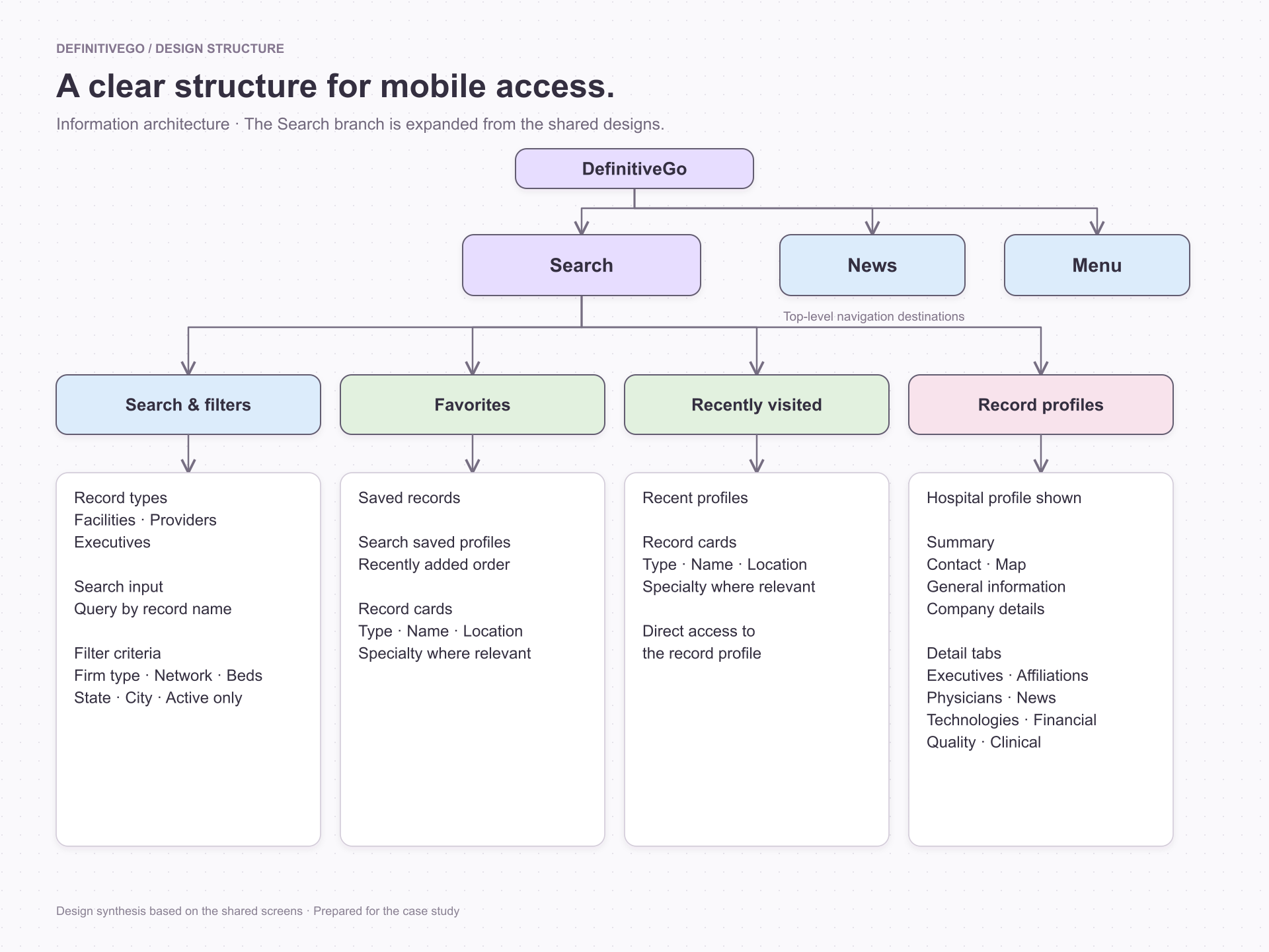
Search provides the starting point. Favorites and recently visited profiles offer shortcuts for returning users. Profile pages then separate essential information from deeper categories, allowing customers to explore according to their immediate need.
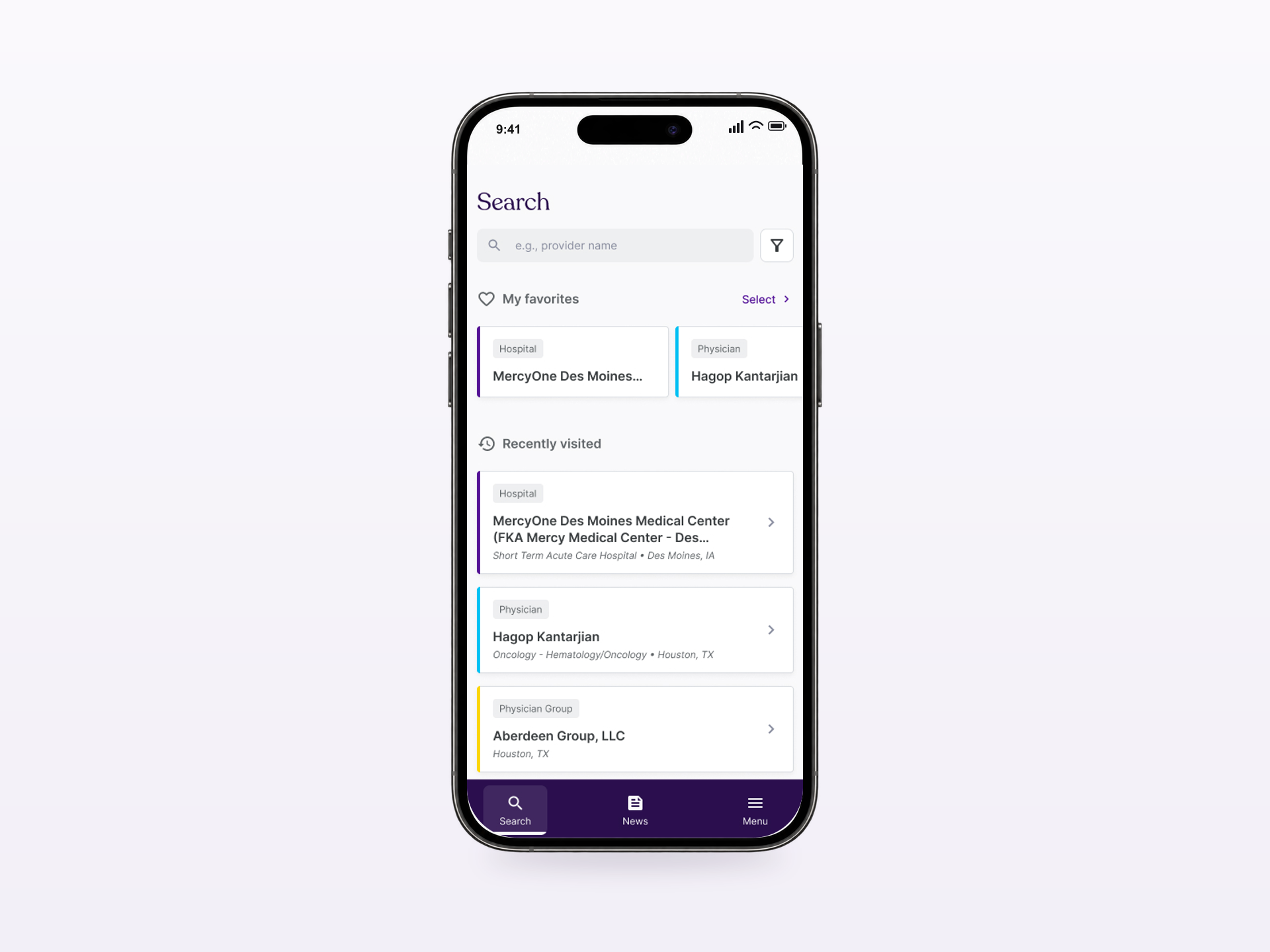
The interface uses consistent cards with record-type labels, names, and supporting details such as specialty or location. Color accents reinforce the categories, while text labels keep each record understandable.
A persistent bottom navigation connects Search, News, and Menu, providing a familiar structure across the app.
User flow: new lookups and saved or recently visited records lead to the same profile experience. Favorites provides a route back on a future visit.Information architecture: Search connects discovery, saved records, recent profiles, and detailed record information. News and Menu remain available through the main navigation.
04 / SOLUTION
The experience, considered.
01
Start with what matters
The search landing screen combines a prominent search field with favorites and recently visited profiles. Customers can begin a new lookup or resume an earlier task from the same place.
This supports both discovery and repeat access during a busy day.
Start with what matters02
Narrow the search
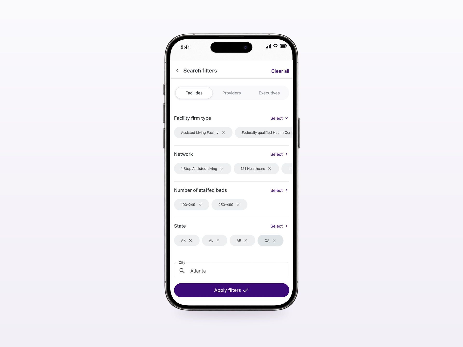
The search designs distinguish facilities, providers, and executives. Dedicated filter screens let customers refine their selection, with selected values shown before they apply the filters.
Facility filters include firm type, network, staffed-bed range, state, city, and an option to show active facilities only. Removable selection chips and Clear all make the current criteria visible and editable.
Moving this detail into a separate screen gives filtering enough space without crowding the search experience.
Narrow the search03
Make profile information actionable
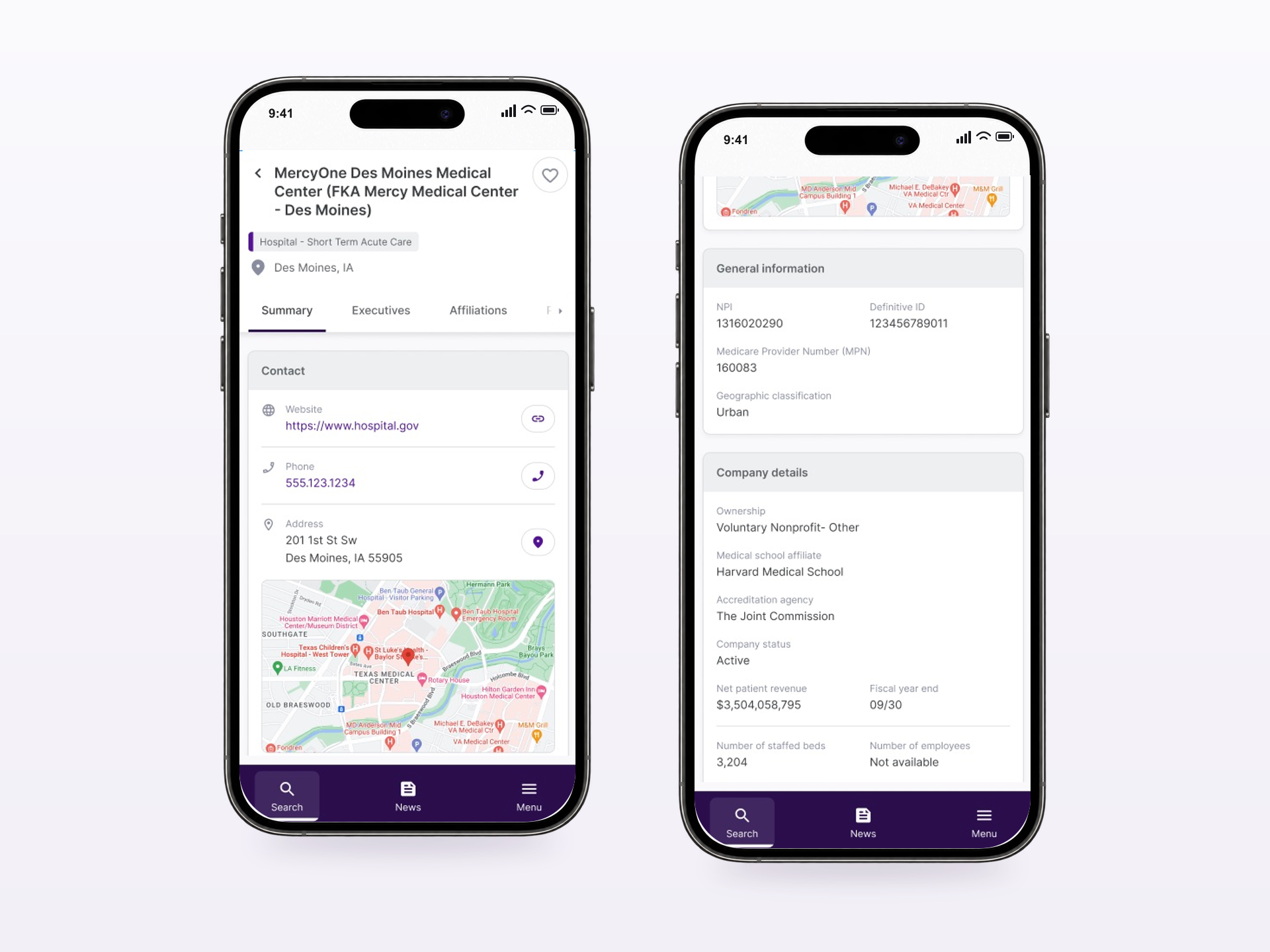
The hospital summary establishes the facility’s identity and location before presenting contact information, a map, general information, and company details.
Website, phone, and location controls sit beside the relevant data. This connects information with the next action a customer may need to take in the field.
Tabs provide access to additional categories, including executives and affiliations. The wider hospital designs also organize physicians, news, technologies, financial, quality, and clinical information into dedicated sections.
Make profile information actionable04
Keep important records close
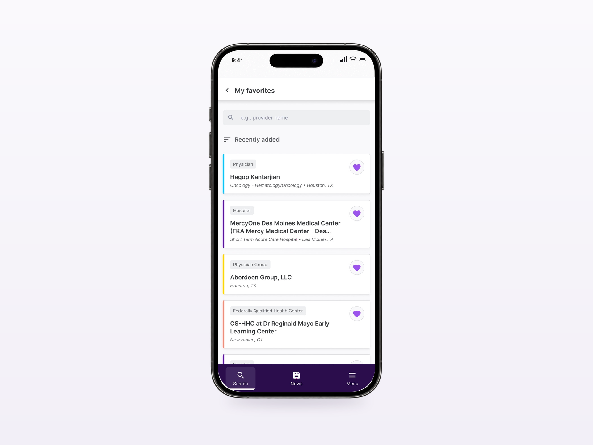
Favorites gives customers a dedicated collection of saved profiles. Each card retains the record’s category and identifying details, while a search field supports finding a specific saved item.
Together with recently visited profiles, this creates a path back to useful information without restarting the full search journey. After launch, 64% of users used Favorites, and the feature was reported to support quicker access to saved records.
Keep important records close
05 / OUTCOMES
What changed.
Within three months, DefinitiveGo recorded 44% adoption and an 86.43% task completion rate. Average lookup time was 2 minutes 34 seconds, compared with over 10 minutes before the mobile experience.
These reported results suggest that customers could find needed information more quickly while away from the desktop. The earlier lookup figure is approximate, so the change is presented as a comparison rather than an exact percentage improvement.
64% of users used Favorites. Alongside the reported positive impact on quick access, this supports the decision to make saved profiles a central part of the experience.
Looking forward
The next opportunity is to understand where tasks remain incomplete and which parts of the lookup journey take the most time. Reviewing these patterns by task type would help prioritize further improvements.
Comparing repeat access through Favorites with a fresh search would help quantify how much time that shortcut saves.
The central lesson is to organize enterprise data around the moment of use. On mobile, the value comes from helping customers reach relevant information and act on it with confidence.