One library, many experiences
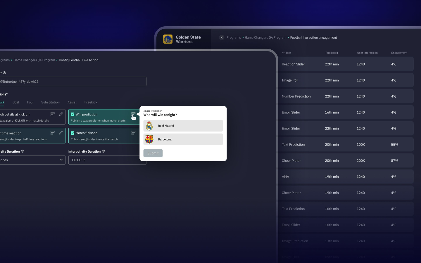
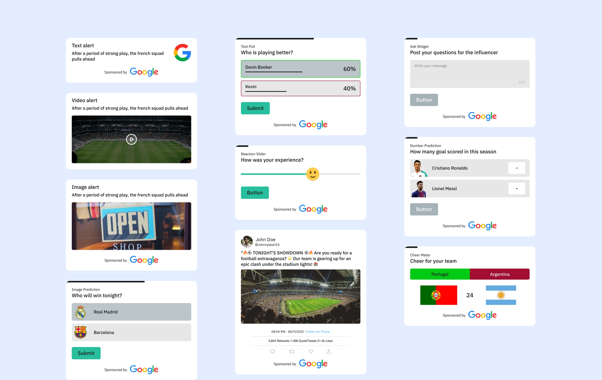
Reusable widgets include relevant states and interactions, providing a consistent foundation for client prototypes.
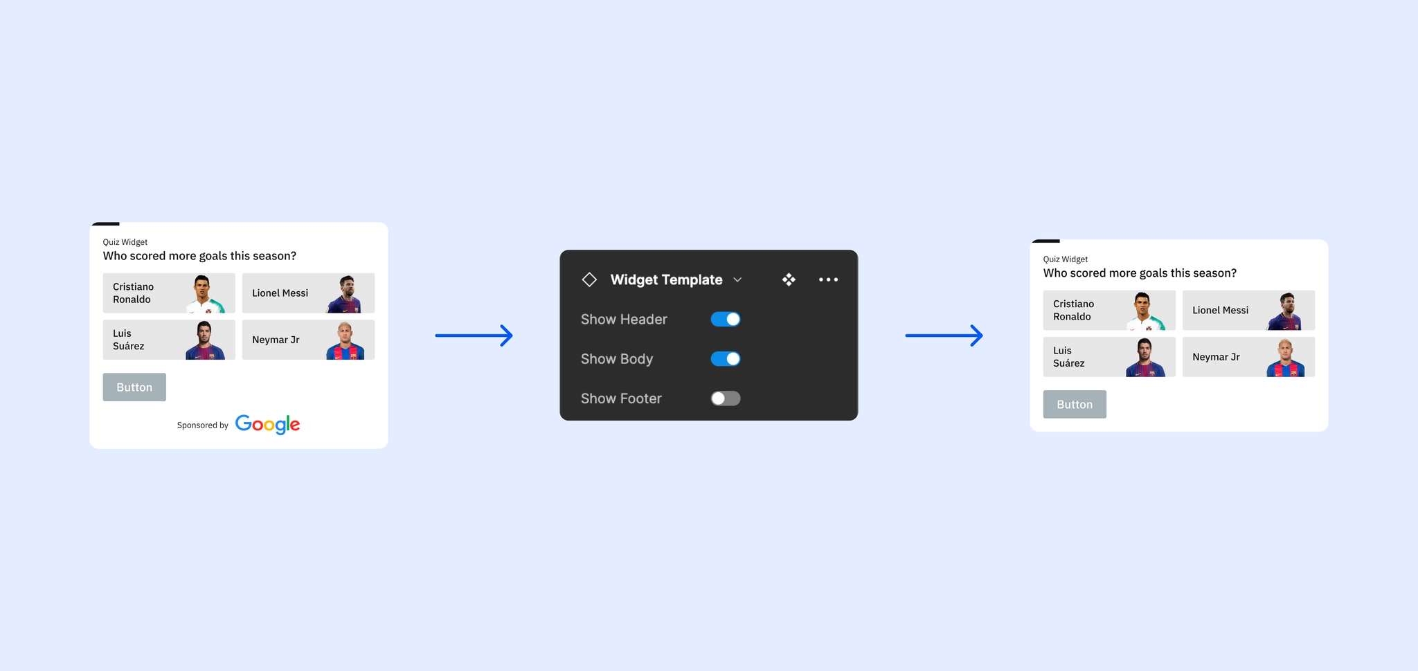


A flexible Figma library that helps designers create branded, interactive proofs of concept faster.
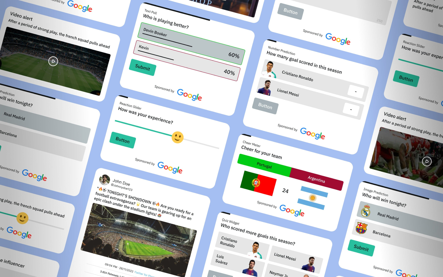
LiveLike’s sales team demonstrates how its interactive features could fit into a prospective client’s platform. Each proof of concept needs to reflect that client’s colors, typography, and visual identity. I led the library’s research, strategy, development, and usability testing with the design and sales teams.
Building custom mockups and prototypes from scratch for every lead took two to three weeks. Designers repeated styling work, missed widget states, and sometimes delivered incomplete interactions. This limited the number of clients the sales team could reach.
Interviews with designers and sales colleagues exposed recurring needs: a complete widget inventory, relevant component options, consistent states, and fully interactive prototypes. New team members also needed a clearer way to discover available widgets and their capabilities.
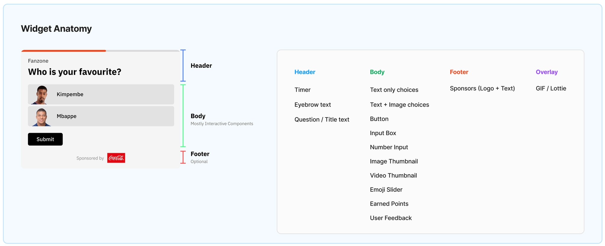
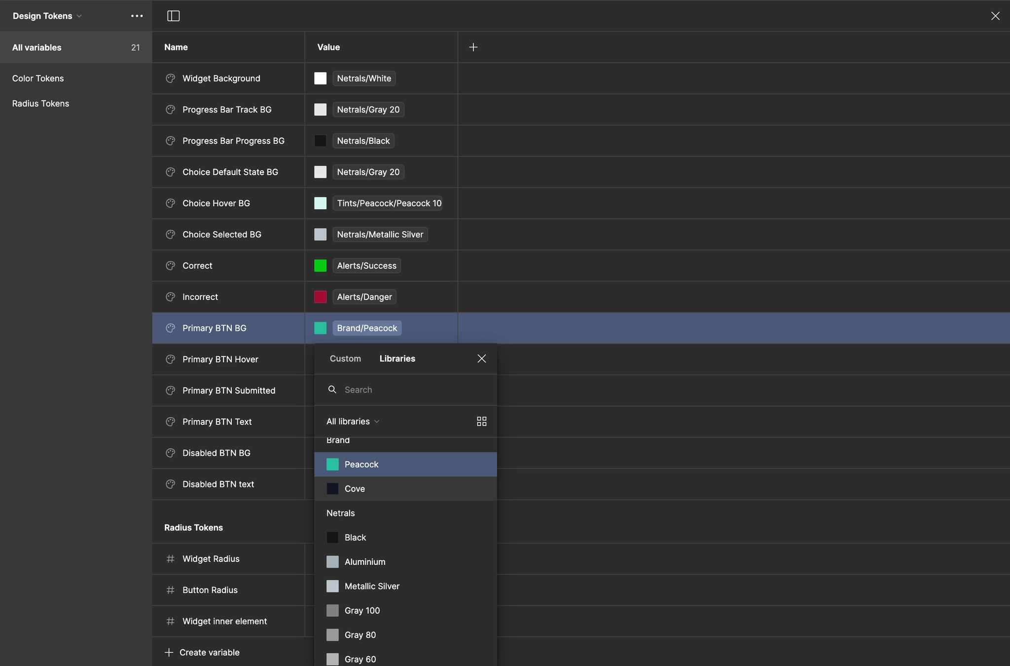
I cataloged the existing widgets and broke them into reusable parts using atomic design. A shared Header, Body, Footer, and Overlay structure established a predictable layout. Color variables, a 4-pixel baseline, and design tokens made each design decision easier to update across a client project.
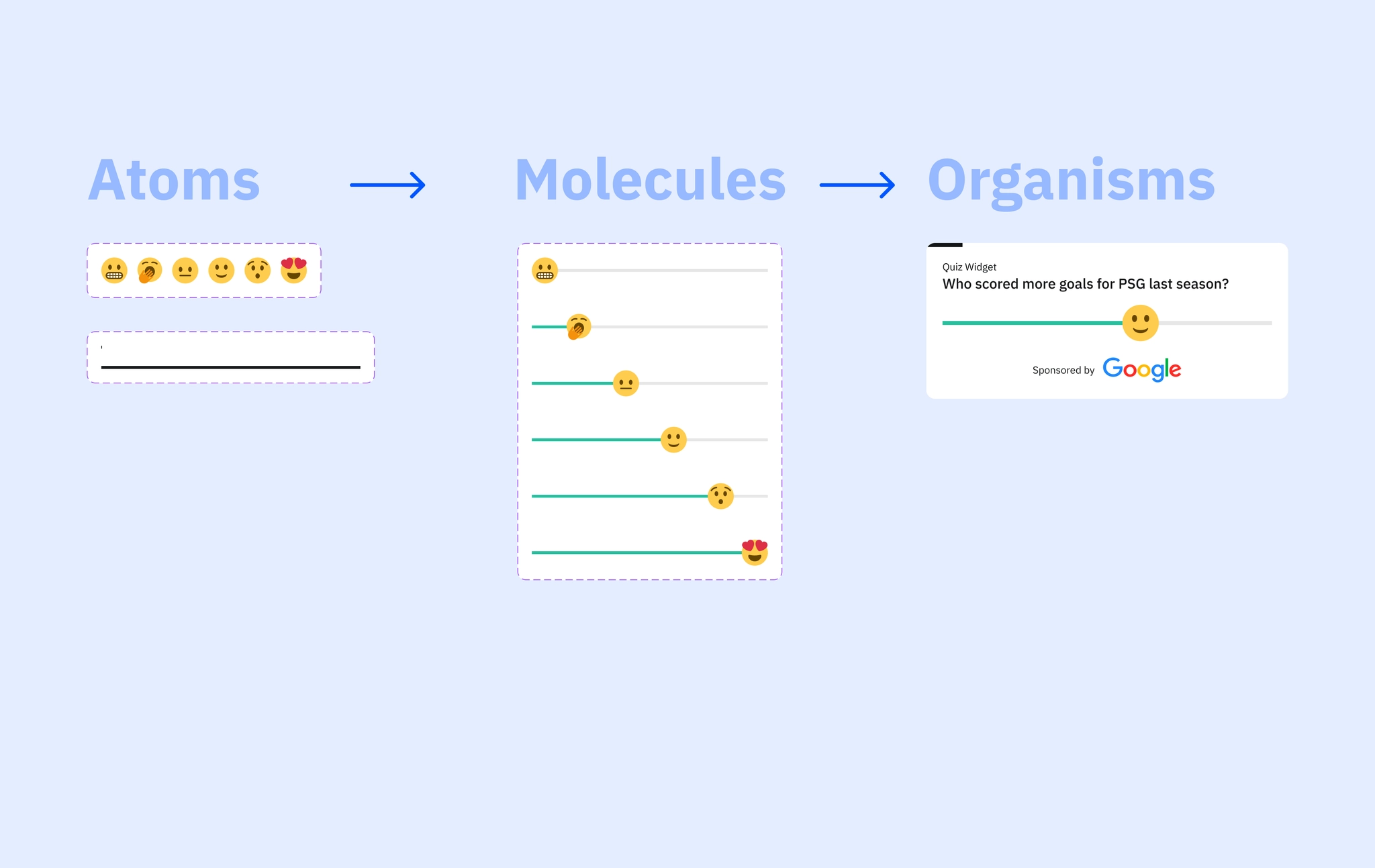
Reusable widgets include relevant states and interactions, providing a consistent foundation for client prototypes.
A properties panel exposes the Header, Body, and Footer sections relevant to each widget.
Each section offers the components it supports, keeping the interface focused and easier to learn.
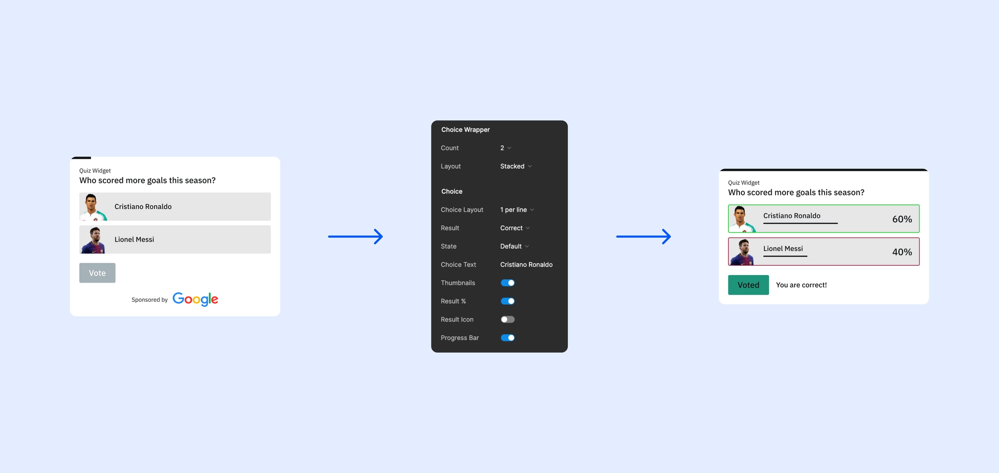
Designers can change individual properties while preserving the component’s connection to the system.
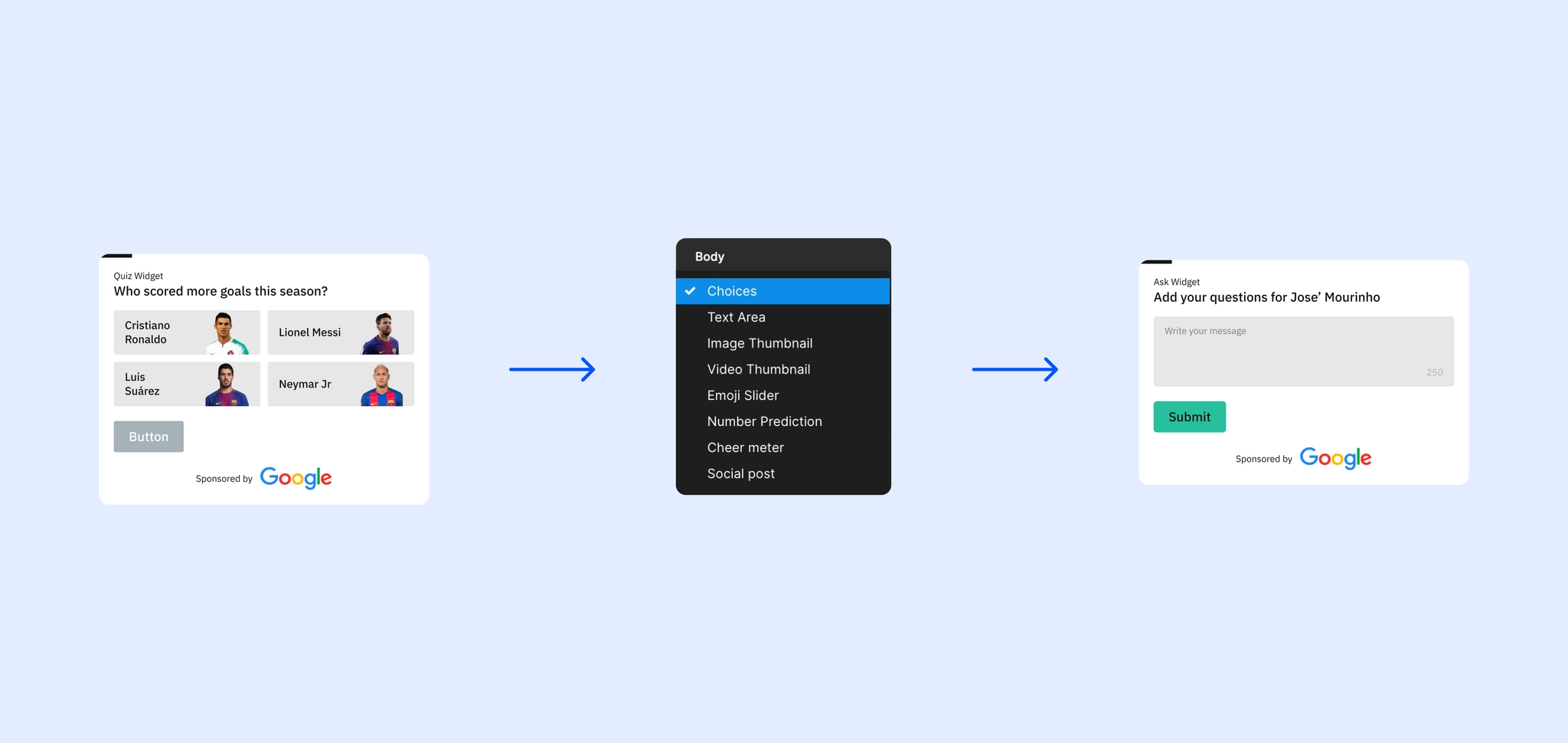
Alternative component designs provide flexibility while tokens maintain a consistent structure.
The library was published for the design team and tested in live proofs of concept, including complete interactive client experiences.
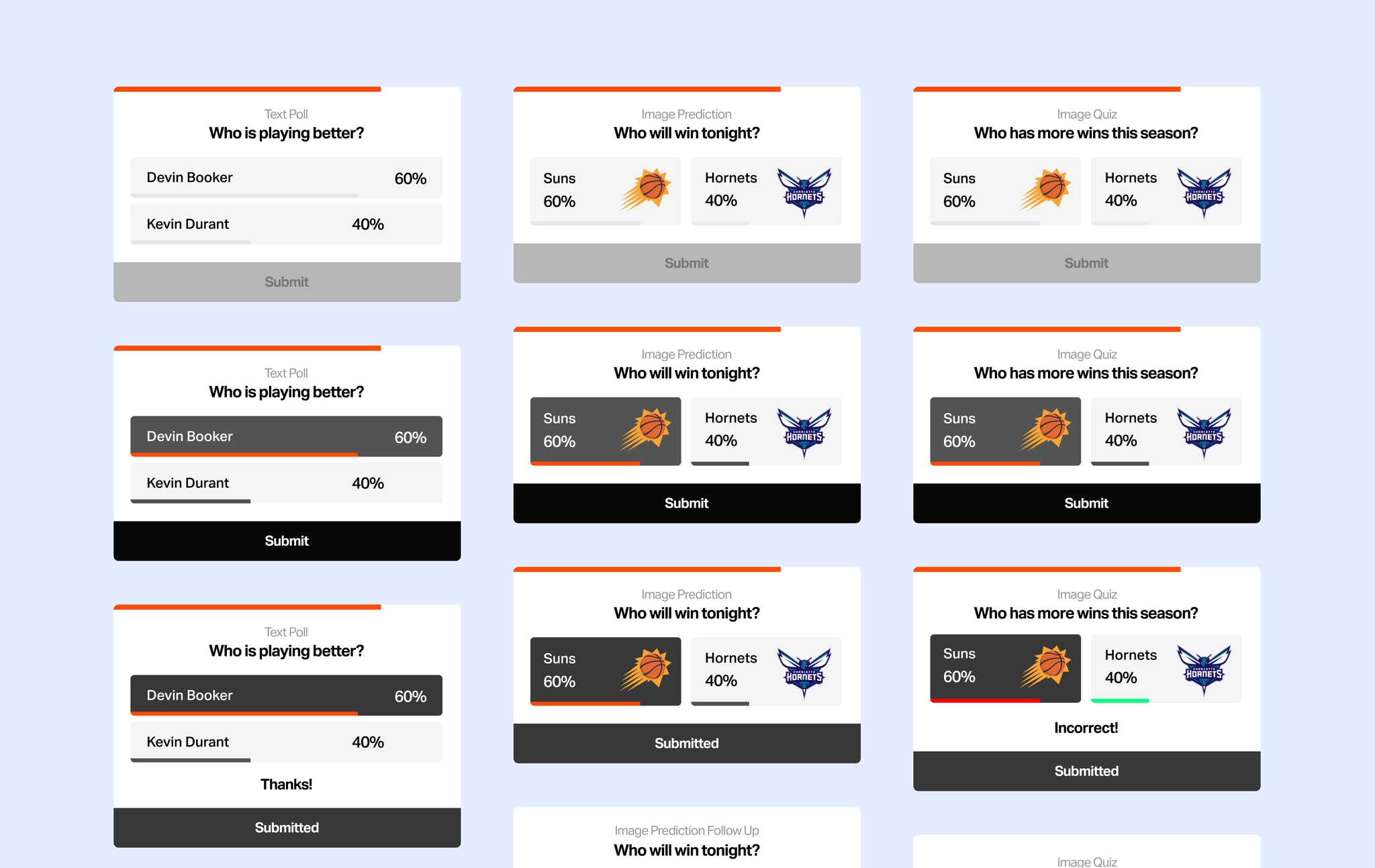
Testing across multiple proofs of concept showed delivery in three to five days, compared with two to three weeks previously. Missing prototype flows fell by 96%. Monthly client outreach grew from three to nine clients—a 200% increase.
Defining tokens and variables early creates a strong foundation for scaling. Regular feedback from the people using the library is just as important as the components themselves. The next step is to expand design alternatives and widget coverage.