Rehyan Chamayil
All Selected Work
LiveLikeAnalytics & user management

The analytics breakthrough that helped businesses keep more users engaged

A centralized analytics and user management tool that gives media teams actionable insights into engagement, rewards, and behavior across millions of users. May–October 2023.

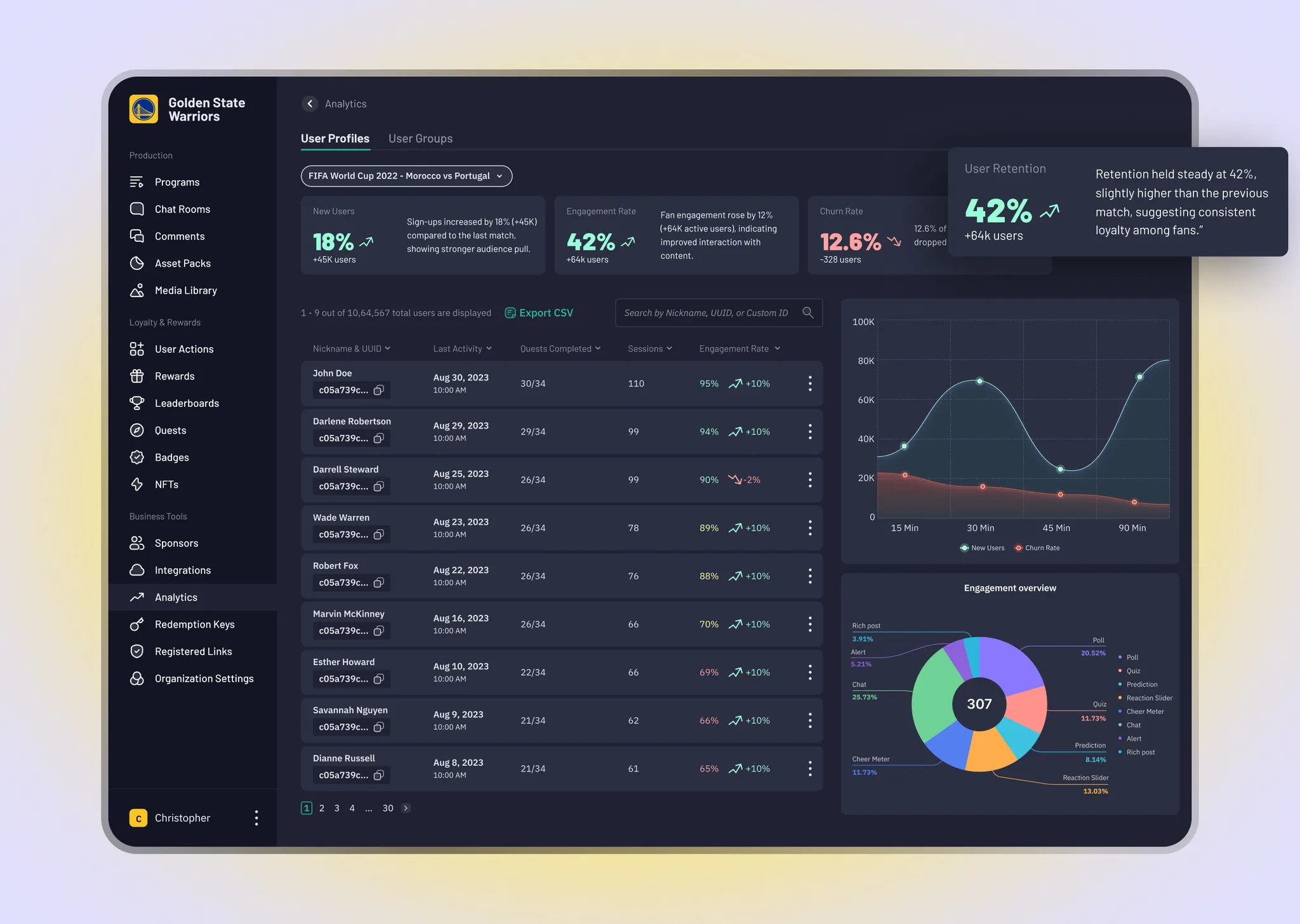
LiveLike user analytics and management dashboard
35%Fewer support tickets for user data
93%Customer satisfaction
12%Boost in retention
18%Improvement in engagement

The context.

LiveLike helps media companies build interactive experiences through chat, polls, quizzes, quests, and rewards. This project brought engagement analytics and user management into the CMS, giving business teams a 360° view of user behavior across programs and the tools to act without technical assistance.

Where the friction was.

Clients could create engaging experiences but lacked the data to understand which features drove retention and what return they delivered. Several clients raised the same concerns: moderation was manual, user insights were scattered, and planning future campaigns felt like guesswork. The goal was a centralized tool to understand, manage, and act on user performance. Success targets included 30–40% fewer user-data support requests, 60% analytics adoption within six months, 15% engagement growth, 10% retention improvement, and 90% client satisfaction.

What I learned

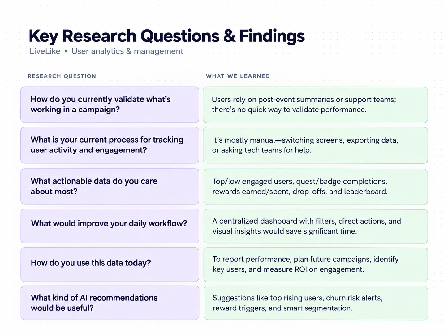
Stakeholder interviews, client feedback analysis, and internal tool audits explored how business users validated engagement performance, where workflows were inefficient, and which data points supported decisions. Research showed a need for a centralized dashboard with filters, direct actions, and visual insights. Users valued new versus churned users, engagement and retention rates, completions, and participation across polls, quizzes, and chat. Familiarity with Google Analytics and Mixpanel offered a useful starting point.
Making the complex clearer.

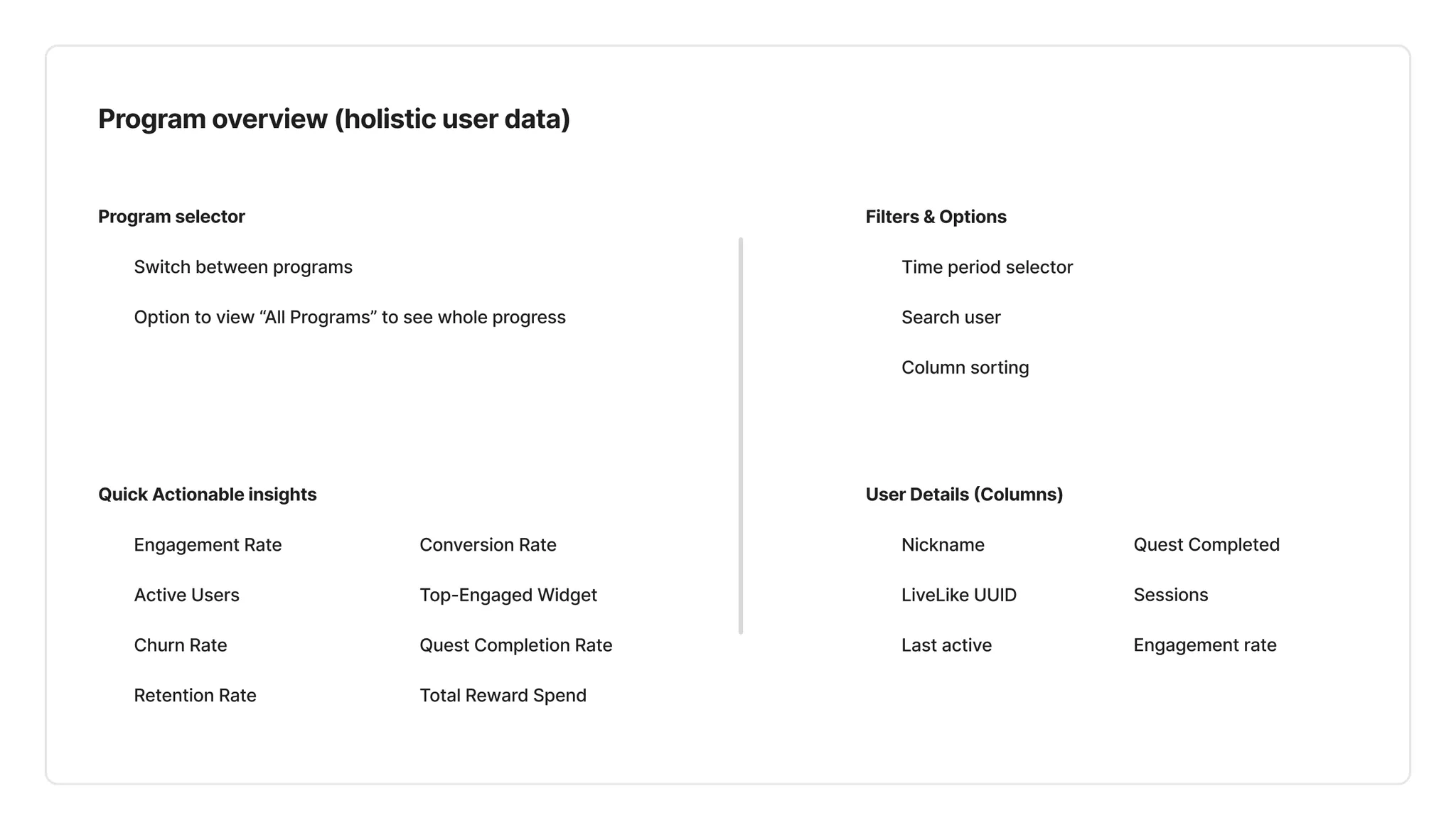
I studied familiar patterns in Google Analytics and Mixpanel, adapting them to LiveLike’s media workflows. The information architecture begins with a program overview, where teams can choose a specific event or see aggregated insights. From there, they can open an individual profile, switch between programs, or inspect a global view of activity. The dashboard prioritizes growth, engagement, churn, and retention while enabling deeper exploration of feature performance, sessions, quests, and individual journeys.

The experience, considered.

01

Overview dashboard

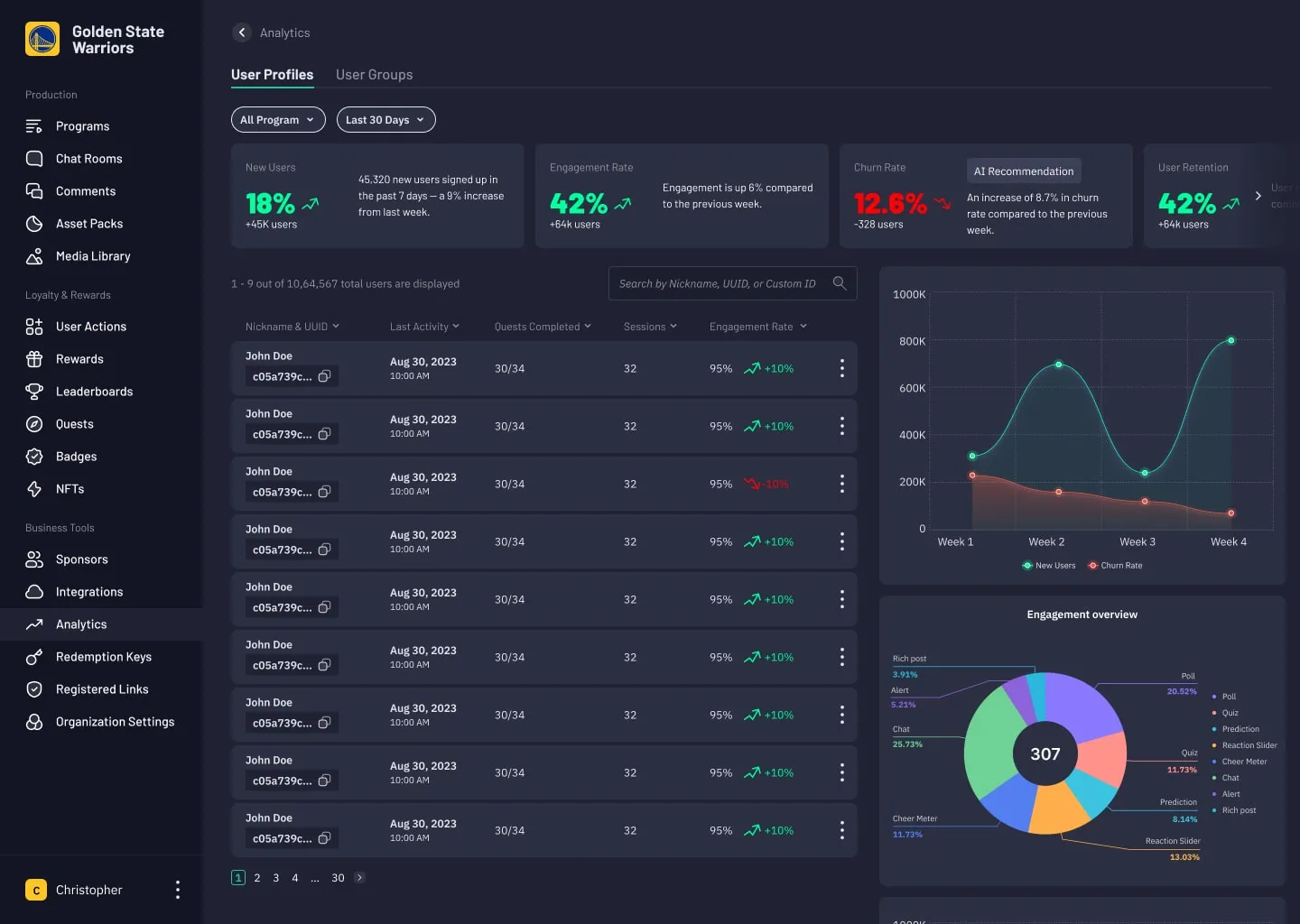
The overview centralizes new users, engagement, churn, retention, and AI-driven recommendations. Activity breakdowns reveal how polls, chats, and quizzes perform, while the user table lets teams investigate individual behavior. Teams can spot growth and risks without changing tools or waiting for reports, then use those insights to plan campaigns and improve retention.

Overview dashboard
Overview dashboard
02

User status

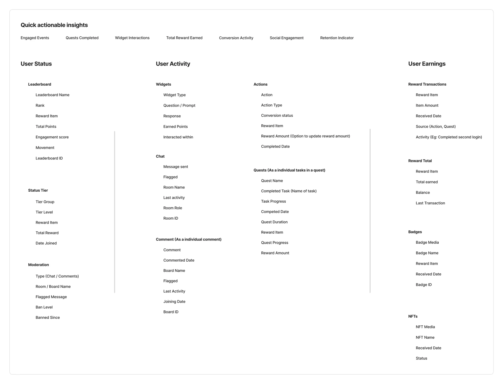
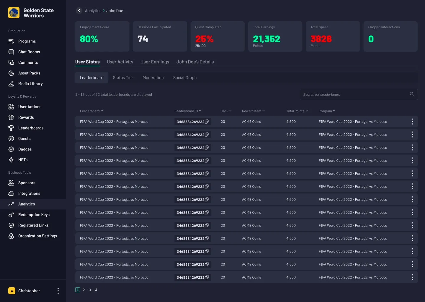
Summary cards surface engagement score, sessions, completed quests, earnings, spending, and flagged interactions. Leaderboards show ranks, points, and rewards across programs; status tiers support segmentation. Moderation provides access to audit history and flagged behavior, while the social graph visualizes community connections in one focused view.

User status
User status
03

User activity

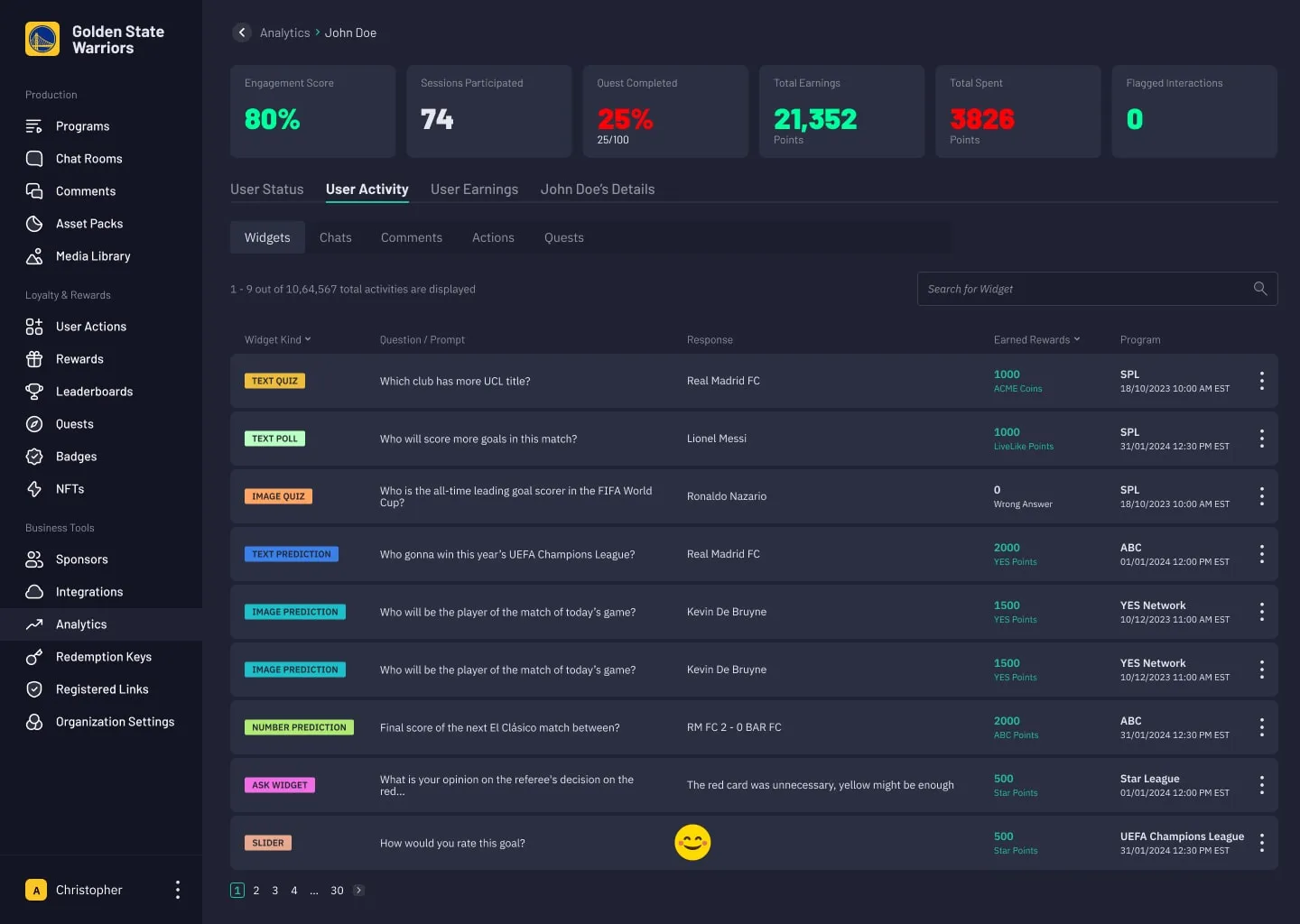
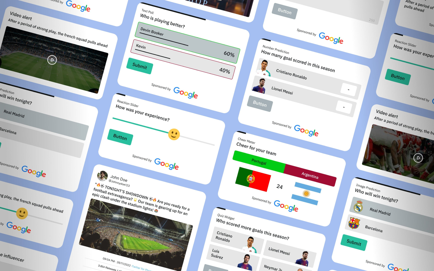
Widgets brings quizzes, polls, predictions, and other interactions together. Chats and Comments provide conversation history and feedback for sentiment analysis. Actions captures user-triggered events to reveal feature usage and behavior, while Quests tracks progress across tasks to understand commitment and long-term engagement.

User activity
User activity
04

User earnings

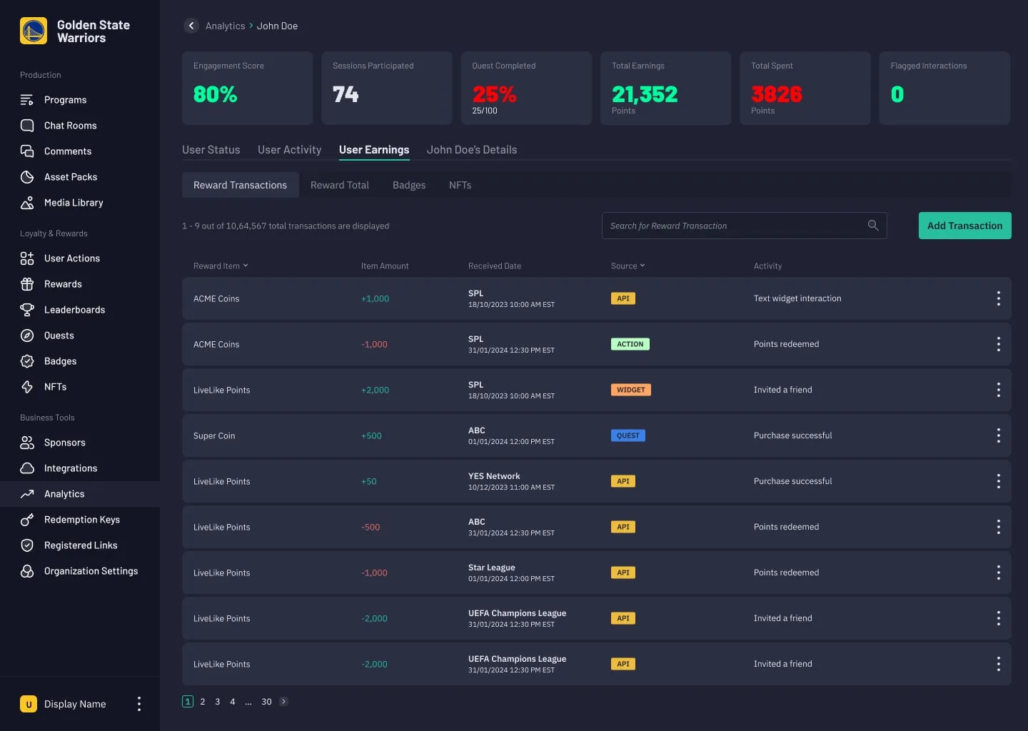
Reward Transactions provides an auditable ledger of points and coins, their sources, and associated activities. Add Transaction lets teams correct missed rewards or make goodwill adjustments. Reward Total summarizes accumulated value, Badges shows achievement milestones, and NFTs makes digital collectibles visible. Together, the tabs help teams review earning and redemption patterns.

User earnings
User earnings
05

Personal details

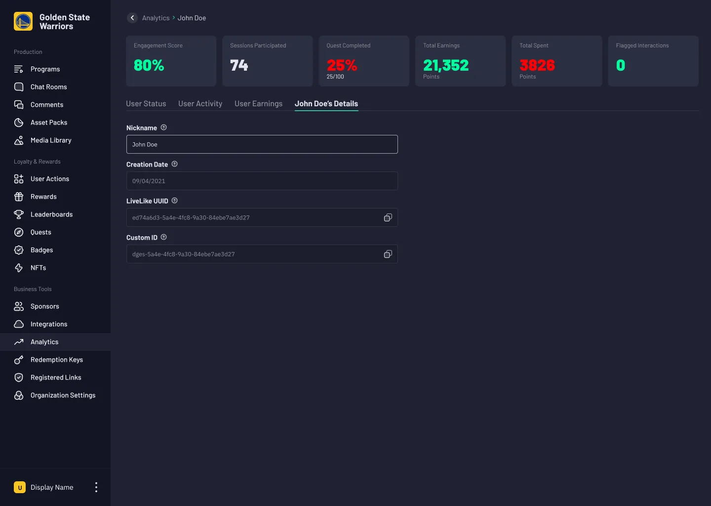
A unified profile consolidates nickname, creation date, UUID, and custom ID. Business teams can reference, verify, and connect user identities inside the platform without relying on external systems.

Personal details
Personal details

What changed.

Six months after launch, support ticket analysis showed a 35% reduction in user-data requests. Product analytics recorded 72% adoption, exceeding the 60% target, with 84% regular usage among active users. Pre/post-dashboard client analysis reported an 18% engagement improvement and a 12% retention boost for clients using data-driven targeting. Surveys of 80+ users, with a 78% response rate, reported an NPS of 8.3 and 93% client satisfaction. Sales attribution reports recorded a 25% increase in cross-selling advanced features. One sports network identified a 12% interactive engagement rate despite high viewership. After improving rewards and introducing targeted, real-time polls, its engagement rate rose to 28%.

Looking forward

This project showed me that engagement features need a way to measure their success. Working with the data team and cross-functional partners deepened my understanding of metrics and how to turn them into actionable design and business insights. A clear analytical system helps customers make better decisions when millions of users interact with their tools daily.